Building a Sales Dashboard: Your Personal Performance Cockpit
As a sales manager, you constantly need to track team performance, monitor key metrics, and make swift decisions. Traditional reporting is slow and lacks clarity. Let’s use Teable’s dashboard feature to build a dynamic, real-time “Sales Performance Cockpit.”Step 1: Prepare Your Data
Before we begin, make sure you have the necessary business data tables set up in Teable.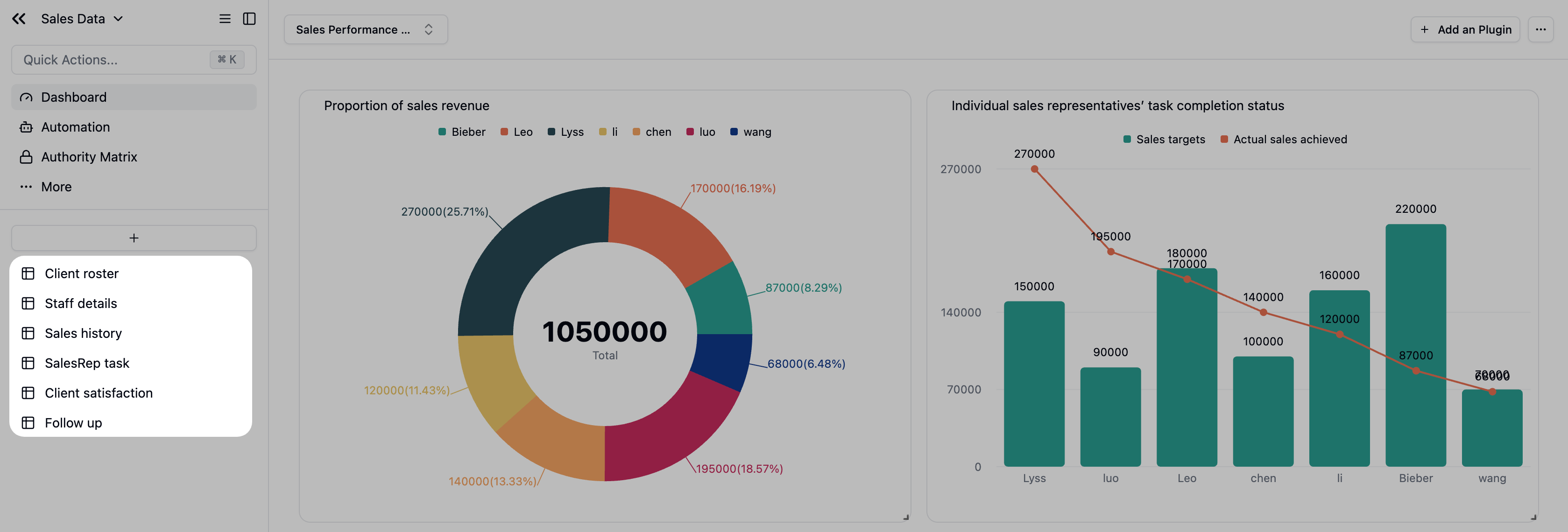
Step 2: Create Your Dashboard
- In the left sidebar, click the
+icon next to “Dashboards.” - Name it
Sales Performance Dashboard.
Step 3: Add Analytical Widgets
Widget 1: Employee Sales Contribution
Let’s add our first widget to the dashboard, starting with a fundamental overview of team performance.Goal: Get a quick overview of the team’s total sales and see each person’s contribution, making it easy to identify top performers.
Data Query Configuration
- Source Table: Select the
Sales historytable. This is where all our sales records live. - Filters: We want to focus on this month’s performance.
- Click
+ Add Condition. - Set the rule to:
Sales DateisThis month.
- Click
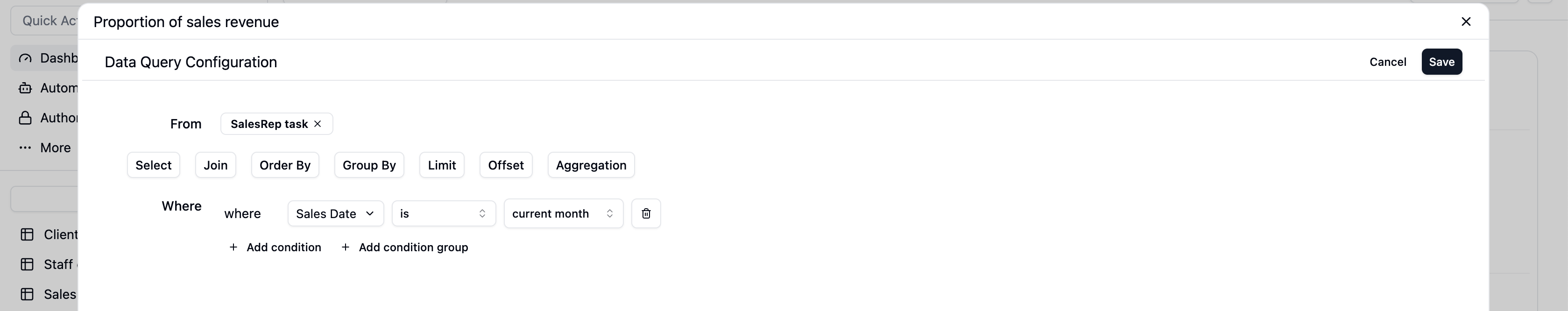
Configure the Chart
- Chart Type: Choose
Pie Chartfrom the dropdown. - Dimension: Select
Sales rep. - Metric: Select
Actual sales achievedtand set the aggregation toSum. - Key Display Options:
- Toggle on
Show values label on chart: This shows the exact sales amount and percentage on each slice of the pie. - Toggle on
Show total: This places the grand total in the center of the chart for an immediate summary. - Toggle on
Show legend: This lists each Sales rep and their corresponding color for easy reference.
- Toggle on
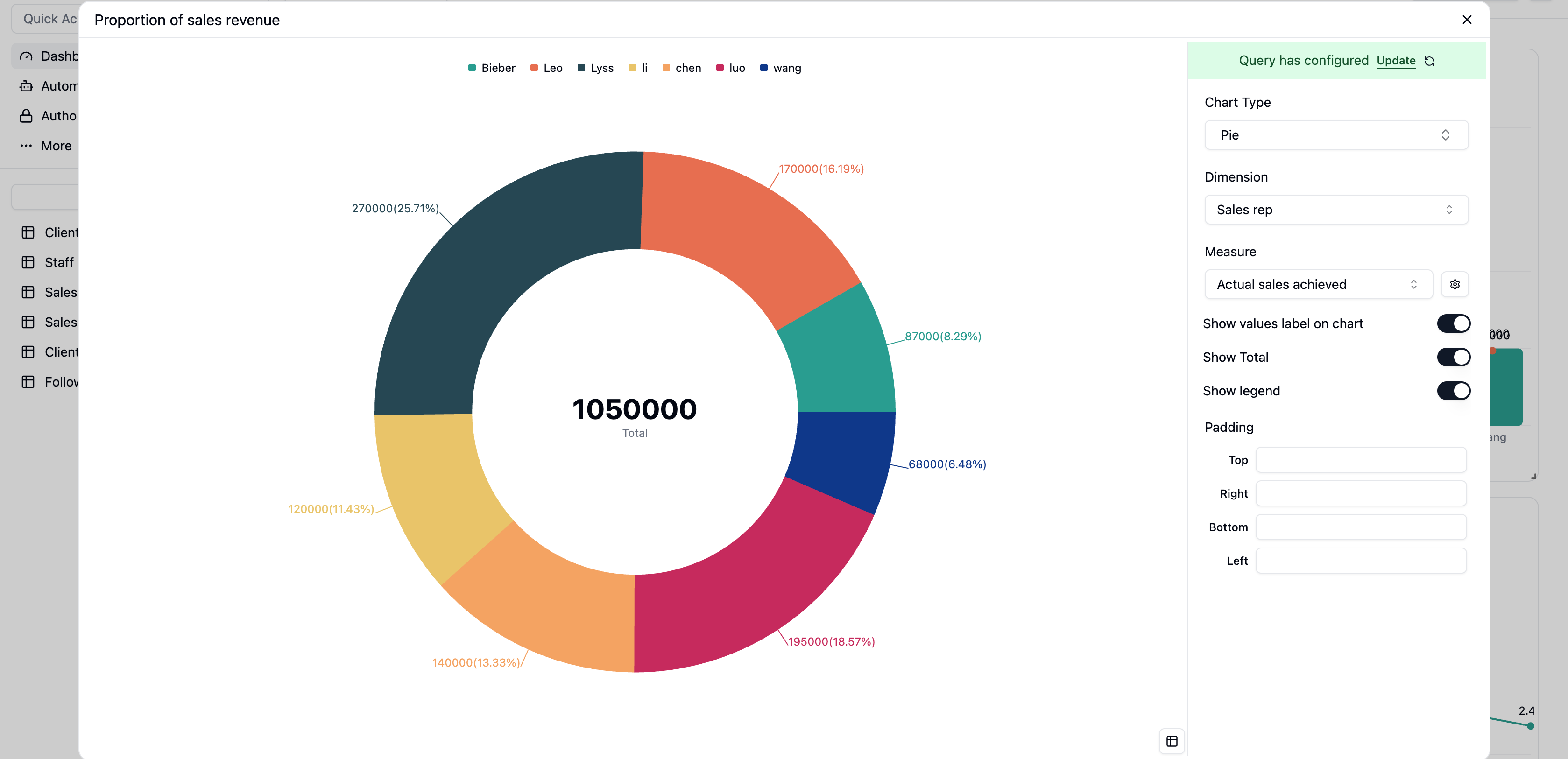
- The team’s total sales:
970,000 - This month’s sales champion:
Bieber, with the largest slice. - Performance balance: Quickly spot performance gaps and identify team members who might need support.
Widget 2: Sales Target vs. Actuals
Goal: Go beyond just looking at sales figures; compare them against set targets. This chart clearly visualizes each rep’s progress, helping you instantly spot high-achievers and those who may need coaching.
Add Widget again. This time, our data will come from the Task Completion table, which conveniently holds both targets and actuals.
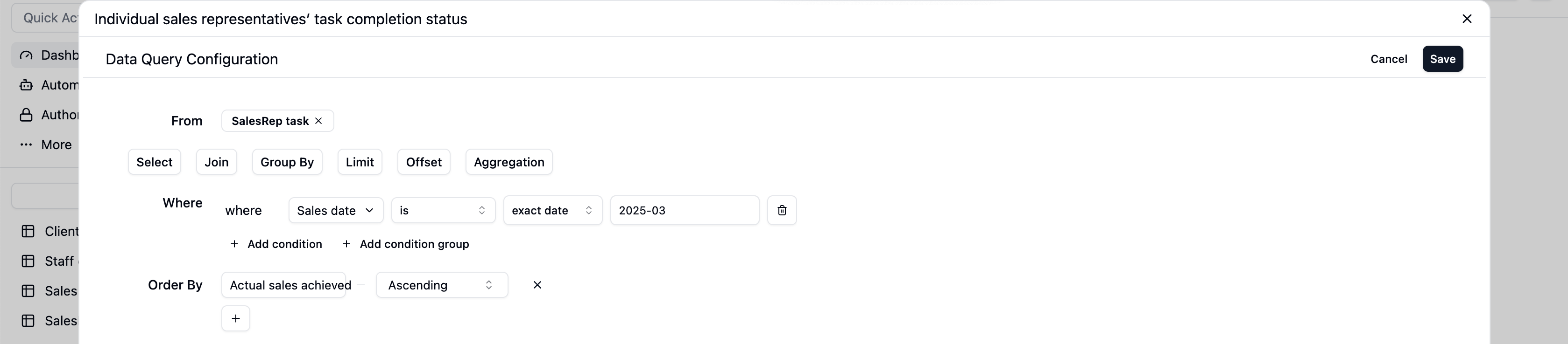
Data Query Configuration
- Source Table: Select the
SalesRep tasktable. - Filters: To review a specific month, we’ll lock the date.
- Click
+ Add Condition. - Set the rule to:
Monthis2025-03.
- Click
- Order by: Let’s Order by
Actual Sales AmountinAscendingorder.
Configure the Chart
Now, let’s visualize this data with an intuitive combo chart.- Chart Type: Select
Bar Chartas the base. - X-Axis: Select
Sales repto compare each rep individually. - Y-Axis: Here’s the key part. We’ll configure two data series:
- Series 1 (Target): Select
Sales Target. This will create the bars representing the goal for each rep. - Series 2 (Actual):
- Click
Add another series. - In the new series, select
Actual Sales Amount. - In this series’ display options, change the style from
BartoLine.
- Click
- Series 1 (Target): Select
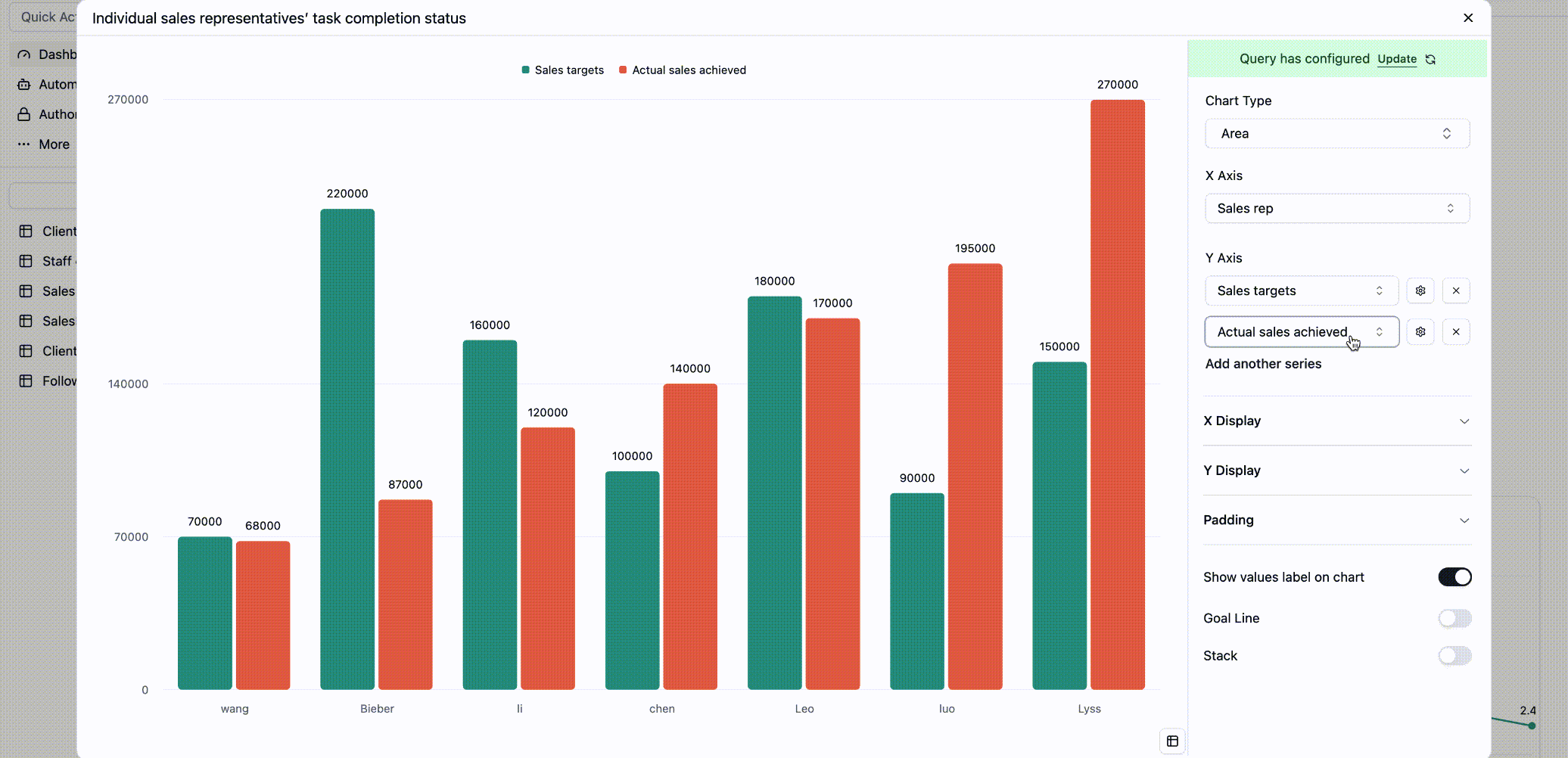
- Top Performers: When the line is well above the bar (like for
BieberandLyss), you know they’ve significantly exceeded their targets. - Areas for Focus: When the line dips below the bar (like for
wang,chen, andli), it’s a clear signal to check in and see if they’re facing challenges. - Team-wide Trend: The overall shape of the line gives you an instant impression of the team’s monthly performance.
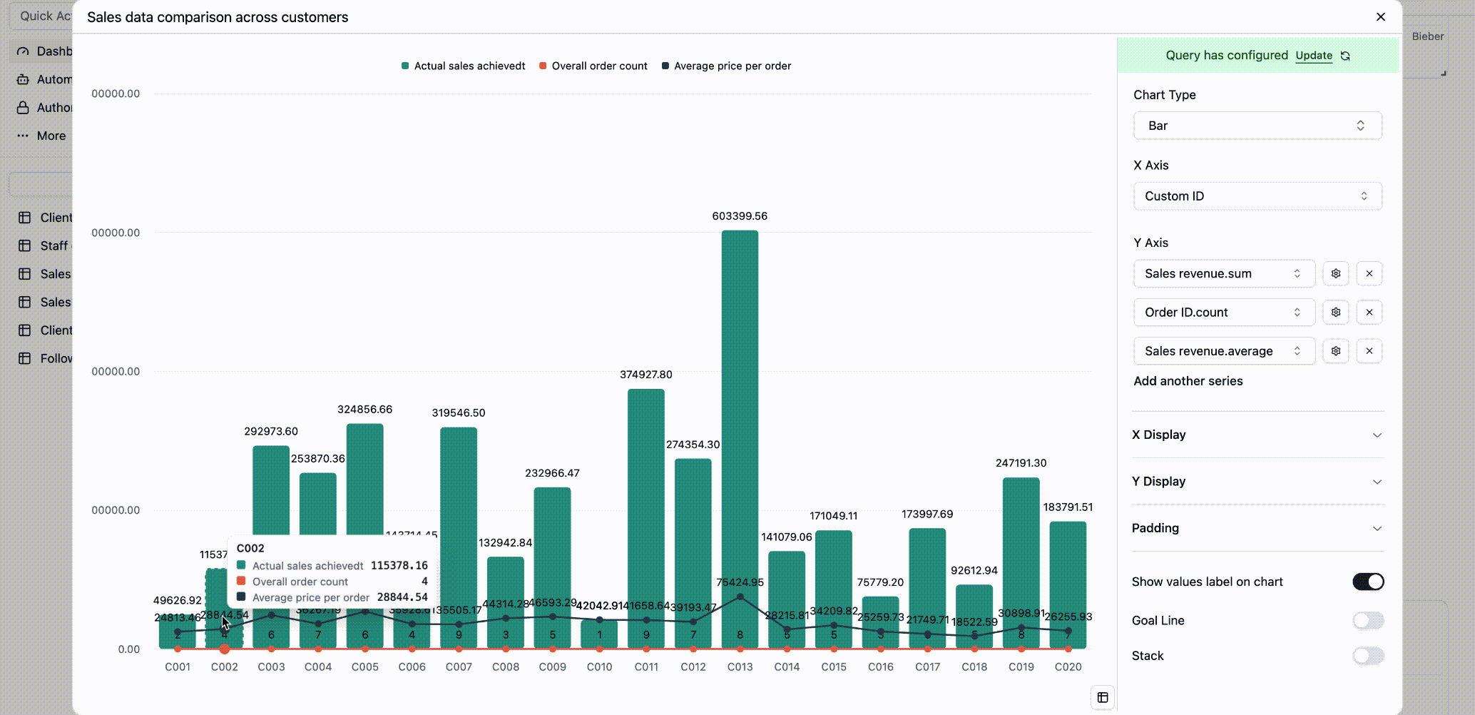
Widget 3: Deep-Dive Customer Value Analysis
Goal: This isn’t just a sales leaderboard. We want to analyze customer value from multiple angles: total revenue, purchase volume, and order frequency. This helps you distinguish between high-value clients and high-frequency loyal customers, so you can tailor your retention strategies.
Sales history table, but we’ll use grouping and aggregation to get these deeper insights.
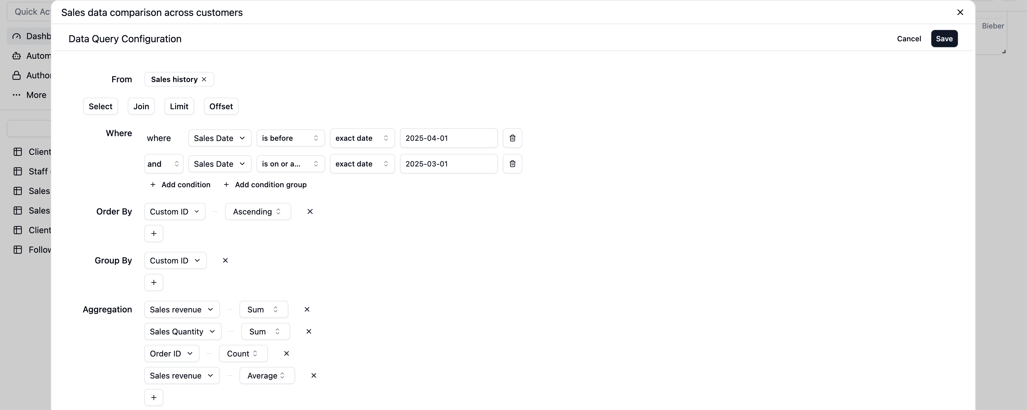
Data Query Configuration
- Source Table: Select the
Sales historytable. - Filters: Let’s focus on a specific time frame for our review.
- Add a condition:
Sales dateis on or after2025-03-01. - Add another condition:
Sales dateis before2025-04-01. (This scopes the data to March).
- Add a condition:
- Group By: We want to analyze by customer.
- Group by the
Linked Customerfield.
- Group by the
- Summarize: This is the most important step. We’ll calculate three metrics:
- Total Revenue: Add a summary for
Sales revenueusingSum. - Total Items Sold: Add a summary for
Sales QuantityusingSum. - Total Orders: Add a summary for
Order ID(or another unique transaction field) usingCount.
- Total Revenue: Add a summary for
Configure the Chart
Let’s display this rich data in an information-packed combo chart.- Chart Type: Select
Bar Chart. - X-Axis: Select the field we grouped by:
Linked Customer. - Y-Axis: We’ll add three data series with different styles.
- Series 1 (Total Revenue): Select
Actual sales achievedt (Sum). This will appear as a bar. - Series 2 (Items Sold): Click
Add another seriesand selectSales Quantity (Sum). This will also be a bar, shown next to the revenue bar. - Series 3 (Order Count): Click
Add another seriesagain and selectOrder ID (Count). Then, change this series’ style fromBartoLine.
- Series 1 (Total Revenue): Select
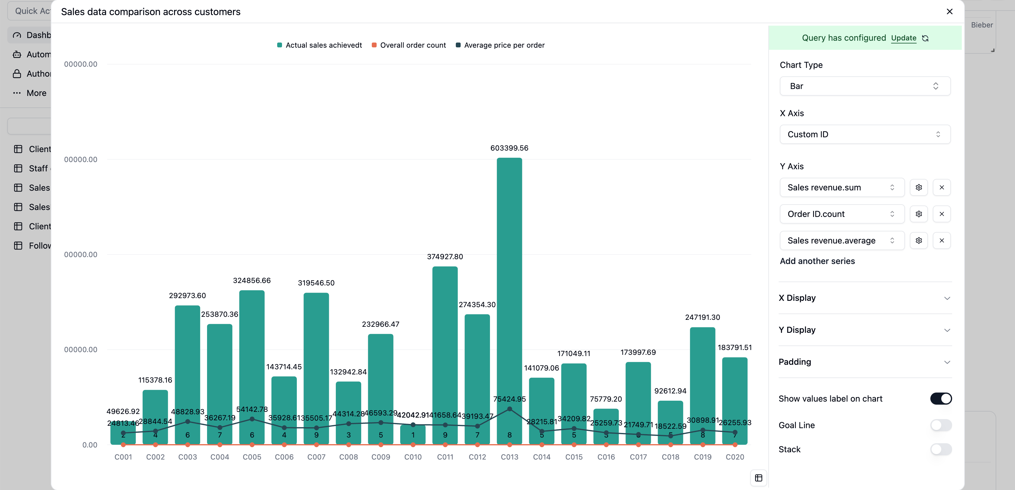
- Your Anchor Clients: The customers with the tallest bars (
C013) are the cornerstones of your business and deserve VIP treatment. - Your High-Frequency Fans: Customers with a high point on the line chart are your loyal, repeat buyers. They’re perfect candidates for new product launches and upselling.
Step 4: Arrange and Customize
Your Sales Performance Dashboard is now populated with widgets. Feel free to drag them around and resize them to create a layout that works best for you.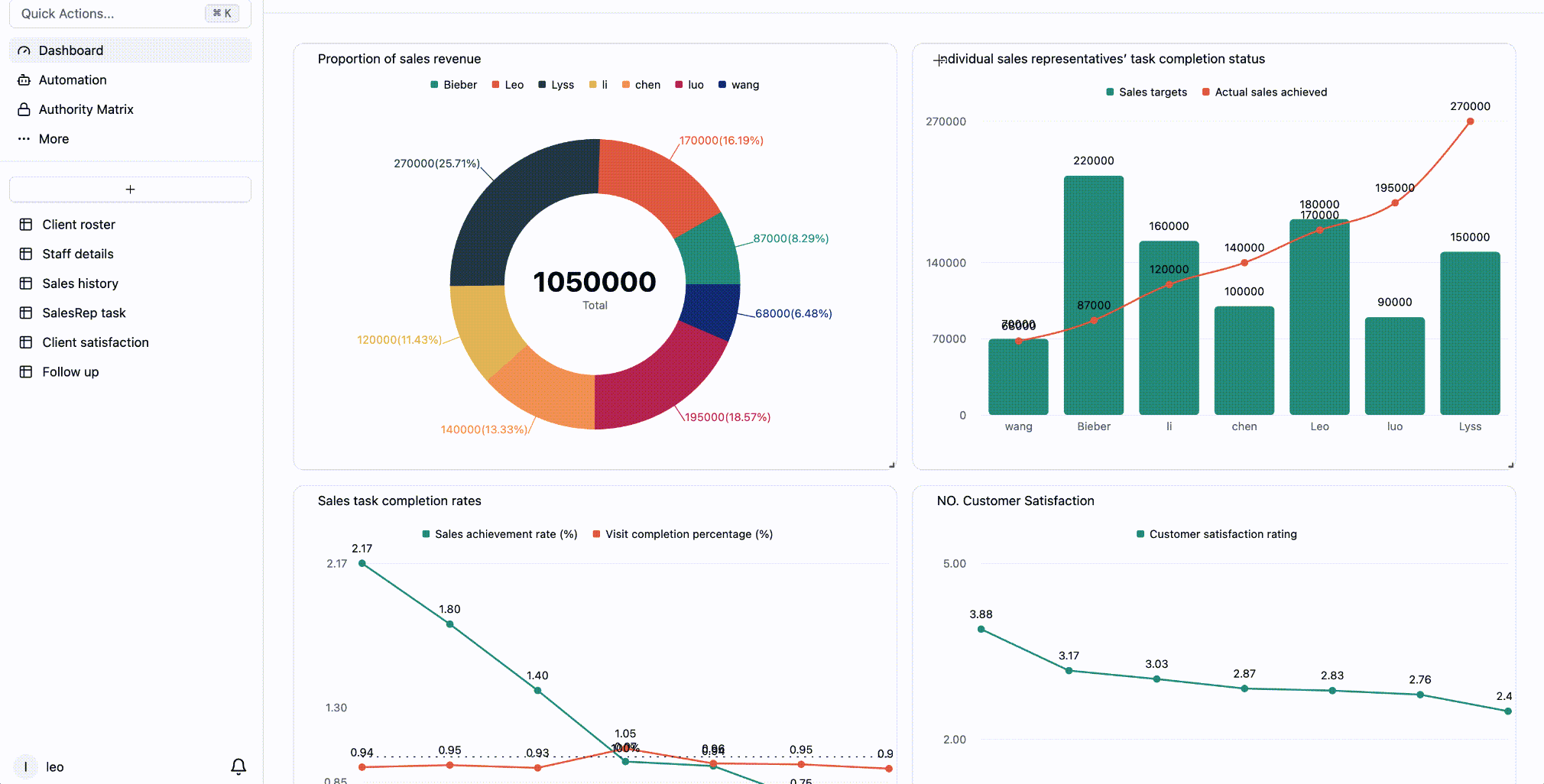
Summary and Next Steps
Congratulations! You’ve successfully transformed raw Sales history into a powerful, visual management tool. With this dashboard, you can:- Monitor in Real-Time: Data is always up-to-date, so you’re always in the know.
- Make Faster Decisions: Quickly identify opportunities and challenges, from celebrating top performers to adjusting sales strategies.
- Share with Ease: Effortlessly share your data-driven insights with your team and leadership.
- Add a Target Line: On a sales trend chart, add a target line to visually track progress against goals.
- Analyze by Industry: Create a new widget to analyze sales by customer industry and identify your most profitable sectors.